eCommerce websites have made it easy for people all over the world to buy the things they want with very little effort.
However, with the most recent eCommerce conversion rates still hovering around 3.3%, there’s no denying there’s room for improvement.

Though 2017 brought in an impressive $2.3 billion USD worth of eCommerce revenue, the truth is, it takes a lot more than a great product to convince people to finalize their transactions.
In fact, moving people through the customer journey is made up of many parts, and starts even before people land on your actual website.
However, if you’re in the process of creating an eCommerce website, complete with your company’s best-selling products, know there’s help when it comes to building your online shop.
In this article, we’ll show you the elements your eCommerce website must have in order for it to be a success and stay competitive among big name brands like Walmart, Amazon, and Alibaba.
So, let’s get started.
1. Winning Homepage Design
First impressions are everything when people come to your eCommerce site.
In fact, people will form a first impression about your website within about 50 milliseconds of landing on your site, deciding right away whether they want to stay or go somewhere else.
That’s why focusing on the things found to capture people’s attention the most is the best way to start creating an effective eCommerce website:
- Company Logo: People want to make sure they’re on the right website, that you’re a real company, and that you have something to offer them that’s worthwhile.
- Navigation Menu: Next to a company logo, people are most drawn to a navigation bar so they can rest assured that exploring your online shop will be easy and intuitive.
- Search Box: Those who land on your eCommerce site looking for something particular are always going to seek out the search bar.
- Main Imagery: There’s a reason eCommerce sites use of large hero images spanning the width of their online shop’s homepage; it draws attention and garners interest.
- Written Content: Consumers want to know you have something of value for them, and that you don’t just want their money. That’s where a clear blogging section comes in handy.
- Footer: People want to how to get back to any section of your site when they reach the bottom. Utilize the footer for things like contact information, subscribe boxes, and navigation menus.
- Speed and Performance: Design aside, there’s more to a lasting impression than great fonts and stunning images. Using a CDN to reduce loading times, for example, can drastically reduce your site’s bounce rate because you won’t have to keep your web traffic waiting.
For reference, let’s look at Wanderlust + Co’s homepage:

To start, they make use of a unique logo, have a clear navigation menu and search bar, and include an easy to access shopping cart.
Not to mention, they have a content translator dropdown, stunning imagery, and clear calls to action so people who know what they want can start buying right away.
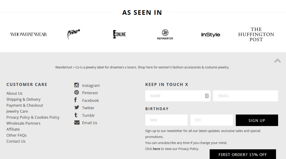
And, if you continue to scroll down their homepage, you’ll notice a carefully crafted footer section dedicated to getting people on the verge of leaving to take convert in some way:

For example, they make linking to the rest of the website easy and include social share icons for expanding their brand to a wider audience.
They even have a cool subscribe box for receiving exclusive sales, discounts, and updates, and offer people making their first purchase a special discount to encourage sales.
But all of this is just the beginning. After all, this is just the anatomy of one eCommerce site’s homepage.
There’s much more to crafting an effective online shop that will convince people to buy.
2. Filtering Options
When people are shopping for products that come in multiple variations, it’s important you give them an easy way to filter their options so they can make a better buying decision.
For example, Oshkosh.com, known for selling children’s clothing, makes filtering clothing options such as Toddler Girl Tops super simple:

Shoppers can search by clothing size, style, features, and type (especially if they are interested in clearance items or sales).
They can even take it a step further and check out amazing values and sitewide categories, which not only help consumers complete their purchases but offer retailers a way to cross-sell items with ease.
3. Special Offers
No matter how you get people to your eCommerce site – organically, pay-per-click ads, social media referrals, affiliate marketing, or email marketing campaigns –potential customers want deals.
This is even true for those that come to your online shop not having a clue what they want to buy.
This is why having a special section of your eCommerce shop dedicated to special offers comes in handy. It helps guide unsure people to buy and makes return customers buy more.
For instance, Best Buy always has a Deal of the Day section for customers to check out:

However, Best Buy also capitalizes on the fact that holidays are always right around the corner and spruces up their special offers to entice customers to get in on the exclusive sales.

Notice the reference to the upcoming holiday, the brightly colored sale section for grabbing people’s attention, and the fact that they mention a significant discount (40% off).
And to sweeten the deal, they even offer an additional $100 gift card on all qualifying purchases, which is significant enough to get a lot of unsure people to finalize their purchases.
If you aren’t sure how to add a special offers section to your eCommerce site to guide people through your sales funnel, or don’t have the inventory a site like Best Buy has, don’t worry.
You can always use the effective strategy of playing on people’s FOMO, or fear of missing out, by instilling a sense of urgency and getting people to act fast, like PrettyLittleThing does:

They make it very clear from the moment someone lands on their retail site that there’s a big sale underway, but that it won’t last forever, as is shown on the countdown timer.
This forces people that don’t want to miss out on a good deal to take the plunge and follow the customer journey right now, even if they were unsure, to begin with.
4. Secure Checkout Process
Besides great web design, exclusive sales and discounts, and all the marketing efforts you put into driving traffic to your eCommerce shop, nothing beats a secure checkout system.
After all, even now retailers are plagued by shopping cart abandonment and struggle to get customers to finalize their transactions, even when they get all the way to the checkout page of their site.
Some suggest that cart abandonment lingers as high as 80% for all retail shops, while others state it’s much lower at 55%.
But one thing is true, it’s a real thing that you’ll have to deal with as an online shop owner.
Luckily, there are things you can do to make it easier for people to finish their transactions and potentially become returning customers after the fact:
- Use official stamps of approval showing your site, and checkout process, is secure
- Include a progress bar so people always know where they’re at in the process
- Display product images at checkout so people can visualize their purchases
- Offer multiple payment options
- Enable wishlist functionality so people can easily come back and finish their transactions
- Always offer a guest checkout option for those that don’t want to register
- Include free shipping, easy returns, and guarantees
For instance, ModCloth makes their progress bar very clear, on top of offering a guest checkout option, and multiple shipping costs (with discounts to make it free).
They also show product images, have a wishlist option, and make domestic returns very easy.

All of this puts the customer at ease as they enter personal and financial information to finalize a transaction.
It also helps convince them that their buying decision is a good one and that it’s okay to finish.
Final Thoughts
Designing an effective eCommerce site takes a lot of thought if you want to push ahead of the stiff competition and build a successful brand.
But, by taking inspiration from others before you that have done well, and thinking in terms of the overall user experience, there’s no reason why you can’t structure your eCommerce site to increase sales.


