When a visitor arrives at a website, they tend to expect certain things out of the experience. They know that there will be a familiar navigation structure and that the design should not just look good, but also function well and be responsive to different types of devices and screen sizes.
The expectations the visitor has can even play an emotional role. For example, the visitor expects to get certain information or see a particular design, and if she gets that, she will walk away feeling good about the website. Consistency in that design can play a key role in the user’s overall experience.
Consistency
As mentioned above, consistency is extremely important. The design, colors, and features of your site should function the same from page to page, and across shopping features, community functions and even on your blog. For example, if you find a site and the landing page has a blue background but the next page on the same site has a green background, you would question whether or not you left the site. Alas, my friend, it’s just inconsistency.
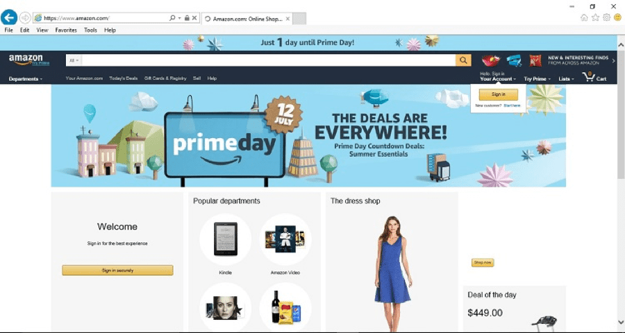
One popular site that is extremely consistent is Amazon.com. There’s a reason why Amazon is a giant when it comes to online retailers.
First, the overall look of the site is the same throughout. The colors are similar. The top navigation remains in place, from drop-down department listings to the ability to grab daily deals or check your account and shopping cart.
This consistency allows users to quickly find the features they want, making the experience fast and seamless.
You can defy user expectations by creating a landing page that’s a bit different than the other pages or occasionally throwing in a special feature. However, it’s best not to stray too far out of the norm, or you’ll risk losing readers.
Define the Company
A really great design will define the company by explaining what the company does or what the overall goal is. A user should not come to a website and try to guess what the company does or is trying to sell. This means the focus is likely very narrow. While the definition will vary greatly depending upon the purpose of your site, knowing the purpose is a great place to start.

Freshbooks does an excellent job of presenting exactly what the company does (it’s an online accounting system that’s user-friendly). Even better, the purpose of the site is to get people to sign up and just give it a try. They know they have an excellent product, and if they can just get you to try it out, you’re likely to sign up for a paid subscription.
Notice how the design is minimal and focused on getting you to sign up for that free trial. Signing up is as easy as filling in two little boxes. The use of contrasting color and call to actions (CTAs) compels the user to sign up, too. Call to action have become more popular and for good reason. This brings the user’s attention directly to your key point without any hassle. But you must have a specific label attached to the call to action or the user might question its intent and not want to proceed.
You can defy the expectations of a company-defining website by throwing in a bit of humor or personality. Just make sure you stay true to the purpose of your company, even when you’re being a bit light-hearted or tongue-in-cheek.
Visual Aids
The old saying goes that a picture is worth a thousand words, and that seems to still hold true today — especially on the internet. Content that has related images gets 94% more views than content without images. Using highly relevant and beautiful images can help you meet user expectations and keep the interest of your readers.
Users can see at a glance if the part is the one they’re looking for and then click on that image for additional information.
The best way to defy this expectation a bit is to make sure there’s a balance between text and images. You don’t want too much of one or the other. Users do need some text — especially on an e-commerce site — to figure out if they want to buy the item. However, images can go a lot further in describing an item than text.
Mobile Responsiveness
Today’s users expect websites to be responsive to whatever type of device they want to use. As of 2016, the time people spend on mobile digital media is at 51%, compared to only 42% on desktops and it’s estimated that there will be 3.5 billion smartphone users worldwide in 2020. Since more and more people are accessing websites via mobile devices, it’s more important than ever that websites are able to adapt to whatever device the visitor is using to access a website.

Notice how simple and streamlined Rent.com is? This straight forward design does not beat around the bush nor do they try to sell you on another idea first. As a user, you’re looking for quick and efficient results. You simply punch in your location and hit “Let’s Go” to start your search. However, the site also easily adapts to mobile devices. Here’s the same page viewed via MobileTest.me on an iPhone 5:

And, this is the way it looks on the Google Nexus 7 Tablet:

As you can see, the site looks similar on the screen of each device, but adapts to the screen size and format of each one without the user having to do anything special, or scroll around endlessly. Responsive design is key for all websites, and if your site does not have it, there goes a lot of your traffic and revenue.
You probably shouldn’t defy this user expectation if you want to continue to expand the reach of your target audience. Mobile responsiveness is also measured within Google’s algorithm, so it’s important to your search engine rank to make sure your website is mobile responsive.
Answer Questions Upfront
A well-designed site highlights how your brand is different than competitors, and answers questions about what types of products or services you offer. Meet user expectations before they realize they have them by asking questions for visitors and then answering them thoroughly.
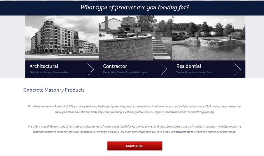
Nitterhouse Masonry Products showcases the different types of masonry jobs they can complete, and highlights the long history of the company and which states they serve. The images are relevant to each type of project, showcasing some of the brand’s best work. Click on any of the links for additional information and you’ll get details about why you should choose Nitterhouse for that project. They go into detail about their experience and show additional images of completed projects, such as brickwork, hardscaping, paving stones and specialty items.
Meet and Defy Expectations
It is vitally important to meet the expectations of your users. You’re competing with thousands of other websites for their time and business. If you don’t meet their needs, they’ll leave and go to a competitor’s site.
However, occasionally throwing something new into the mix can keep things interesting and entice visitors to come back and see what else you might have to offer. The key, as with most things related to design, is to create the perfect balance between meeting expectations and defying them.
About The Author:
Lexie is a UX content strategist and web designer. She enjoys copious amounts of coffee (with a dash of milk) and walking her goldendoodle. Check out her design blog, Design Roast, and follow her on Twitter @lexieludesigner.
